Case Study:
Just Press Play
Opportunity
An initiative that allows customers to “just press play” to start listening to the beginning of any title for free, with a seamless transition to continue listening to full title via signup, redemption, or purchase.
Company
Audible
Role
UX lead for discovery and execution
Surfaces
iOS, Android, Web, AoA
Customers
Prospects, Formers, Members
1
Understanding the opportunity
2
Ideate + Design
3
Test + Validate
Understanding the opportuity
Identifying key customer
The target customer is any Audible user (anonymous, logged-in non-member, member) who is seeking a more convenient and delightful way to listen to content before committing to signing up for membership or making a purchase, with an emphasis on attracting and retaining light listeners.
Gathering insights
Past research and data:
Kicking off our project we partner with our UX Researchers and Data Analysts to help source and analyze past research and site data to help us drill down to key problems we want to focus on for their initiative
Competitive landscape:
To better understand the landscape and identify opportunities for differentiation, I conducted a competitive analysis of key products offering similar functionality. I focused on user flows, visual design, feature sets, accessibility, and onboarding experiences.

Customer problems identified
-
High barrier of entry to listen
Before a customer can begin listening to a title, they are required to make a purchase or sign up decision.
-
Sample Content Not Compelling
The sampling experience often plays an excerpt from the middle of the title that is too short in length for customers to judge their interest in the book before committing to purchase.
-
No Continued Listening
The sampling experience is a dead end, as samples conclude without a path to a purchase or continued discovery if the user is not interested in the title.
-
Transaction-Focused
Audible has an emphasis on directing a prospect to immediately sign up for membership, or a member to make a new purchase rather then focusing on finding the right title fit or getting the user excited for the types of content and Audible as a service.
Ideate + Design
Directions for explorations
An iterative in-market experimentation approach to start testing each individual MVP/P0 feature.
Variations will span across all surfaces: Amazon Web, Audible Web, Apps
Hi-fi
Prioritization was identified based on business and user needs:
Sample button placement and UI within Product Details Page
Change sample clip to start from the beginning up to 10 minutes
Add path from sample player (cloud player) to purchase or subscription
Showcase “First 10 min” within CTA or sample kickoff
Add sample functionality to other discovery points

Next Steps
We shared our project success and future plans during an internal PI Summit
User Testing
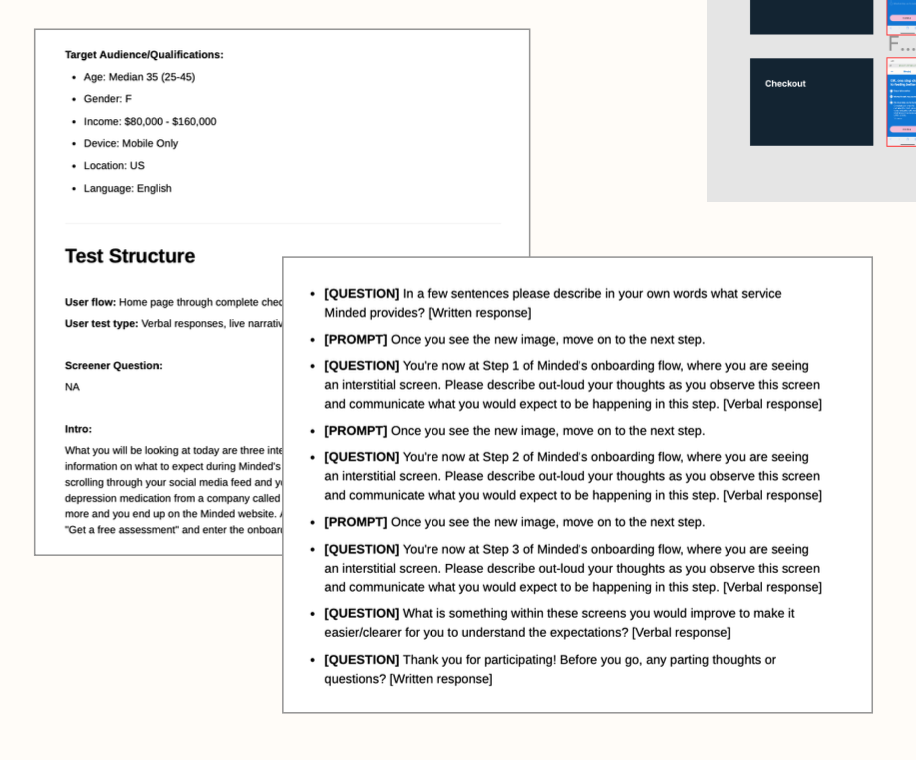
Test Setup
Creation of brief with test structure, audience and test prompts/question.
Document will serve as place of reference for stakeholders and cross team collaboration.
Insights
Positive feedback on overall added value of screens. Will launch to monitor and track changes in conversion and funnel drop off.


Test + Validate
Within two weeks onboarding drop-off decreased by 33% and quick cancelations decreased by 5%
Rolled out to 100% of customers post two week results
Identified Solutions
-
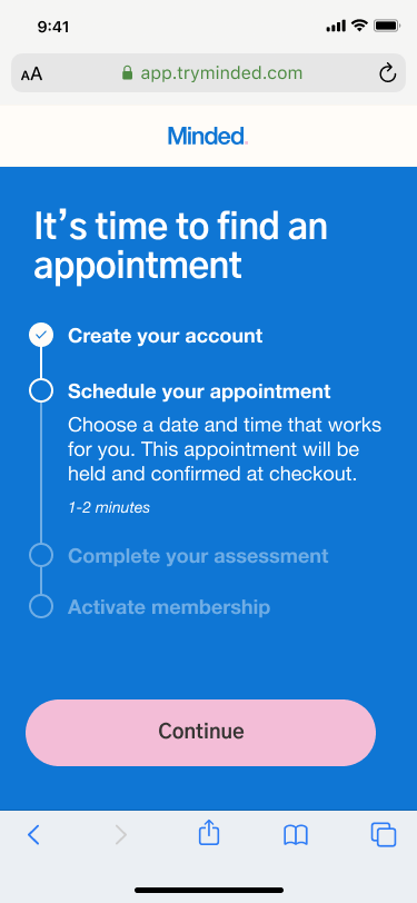
Phase 1 - COMPLETED
Create interstial screens to better set expecations during onboarding, scheduling, and checkout
-
Phase 2
Update calendar ux and move scheduling to be pre-checkout. (Current flow users have to checkout to see availability of appointments)
Phase 2
Ideate + Design
Updated User Flow
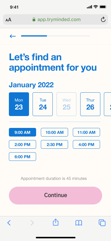
Updates to the prospect flow to move scheduling prior to intake and checkout.
Existing:
sign-up, intake, checkout, scheduling
Updated:
sign-up, scheduling, intake, checkout
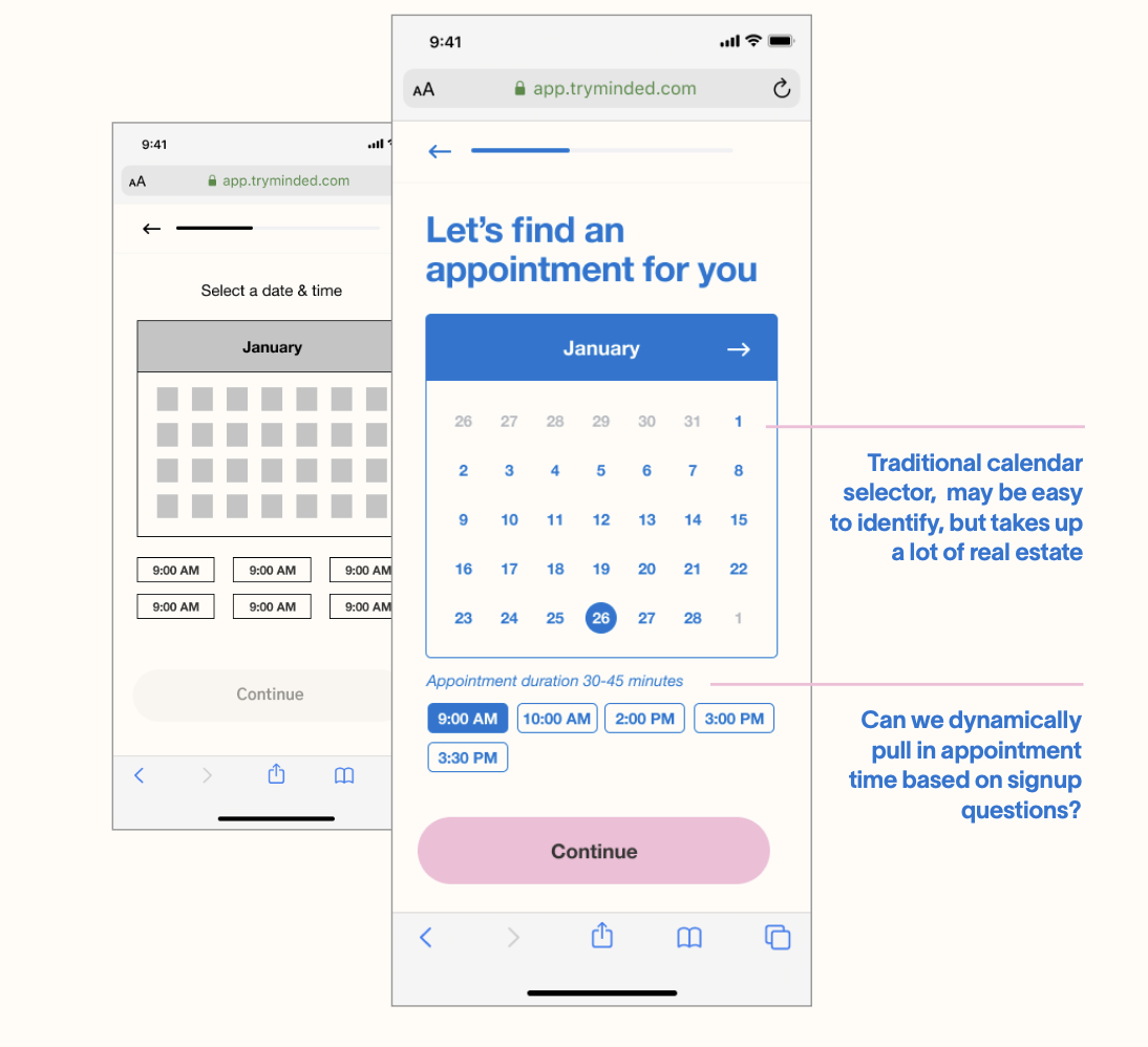
Explorations Lofi to Hifi
Explorations done of calendar layout and appointment selection help users quickly identify and select their appointment time while staying with our brand/design system style.

Usability Testing
Updated User Flow
Positive:
Date and time:
“Very quick easy”
Simplicity of date and time picker
Dragged dates over easily (intuitive)
Seeing dates and times on the same screen
Choosing date first and then seeing the available times
Appointment duration display
Confirmation, appointment details:
Appointment summary with picture of provider, bio, date and time
Gives familiarity and comfort
Bio and face of the person they will be meeting with
Acknowledged “holding” language with neutral or positive response
Acknowledgement of confirmation once membership is activated
1/10 users would have preferred to see a traditional calendar view
Negative/Painpoint
Date and time:
Prefer to choose who (the provider) before selecting a date and time.
Choice of male or female
Prefer to see calendar view (referenced having same view as the calendar you use to add meetings, appts ex: apple calendar, google calendar)


Updated screens for implementation
