Case Study:
Post-checkout activation, reducing quick cancels
Problem
26% of users completing checkout were canceling their subscription within the first 6 hours.
Company
Minded
Focus
Analyze, Ideate, Test
1
Understanding the Problem
2
Ideate + Design
3
Test + Validate
Understanding the problem
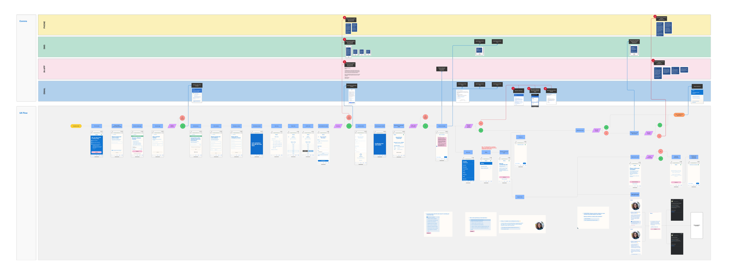
User flow
Collaboration with Lifecycle Manager to ensure all communications were included in the flow. This would help us identify gaps and areas we could improve
Survey
What was driving users to quick cancel? Time for a survey!
130 participants (all quick cancel users)
Main takeaways:
33% of users canceled because they couldn’t book the appointment they wanted.
29% of users surveyed were not aware that Minded was a monthly membership.
25% of users didn’t feel like they had the right information presented to them
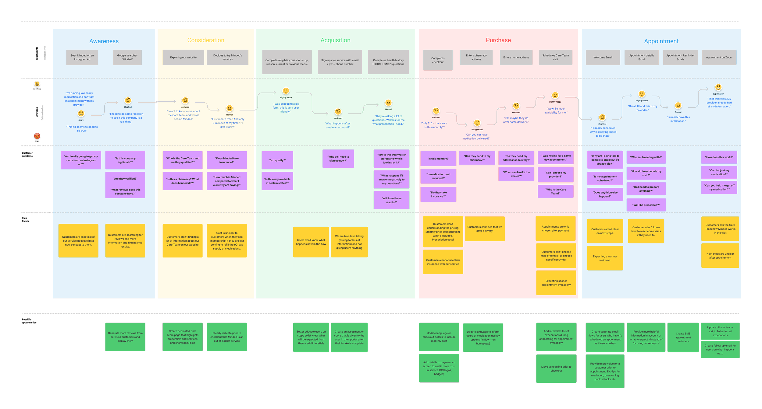
User Journey
Layering the survey results on the user flow we were able to more clearly identify key pain points to help kick off ideation for improvements for our customers.
Identified Solutions
-
Phase 1
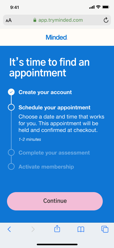
Create interstial screens to better set expecations during onboarding, scheduling, and checkout
-
Phase 2
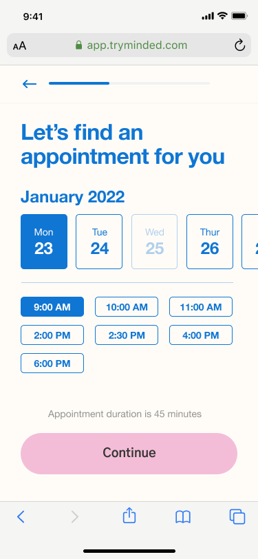
Update calendar ux and move scheduling to be pre-checkout. (Current flow users have to checkout to see availability of appointments)
Phase 1
Ideate + Design
Sketches + Lofis
Initial lofis to convey ideas and main objectives with screens to review with key stakeholders.
Hi-fi
After collecting feedback from stakeholders and we continued iterations bringing them to highs to begin working with our copywriter to prepare for user testing.


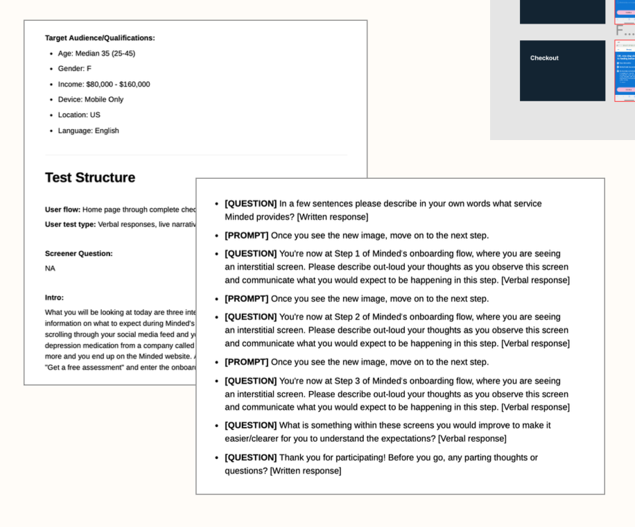
User Testing
Test Setup
Creation of brief with test structure, audience and test prompts/question.
Document will serve as place of reference for stakeholders and cross team collaboration.
Insights
Positive feedback on overall added value of screens. Will launch to monitor and track changes in conversion and funnel drop off.


Test + Validate
Within two weeks onboarding drop-off decreased by 33% and quick cancelations decreased by 5%
Rolled out to 100% of customers post two week results
Identified Solutions
-
Phase 1 - COMPLETED
Create interstial screens to better set expecations during onboarding, scheduling, and checkout
-
Phase 2
Update calendar ux and move scheduling to be pre-checkout. (Current flow users have to checkout to see availability of appointments)
Phase 2
Ideate + Design
Updated User Flow
Updates to the prospect flow to move scheduling prior to intake and checkout.
Existing:
sign-up, intake, checkout, scheduling
Updated:
sign-up, scheduling, intake, checkout
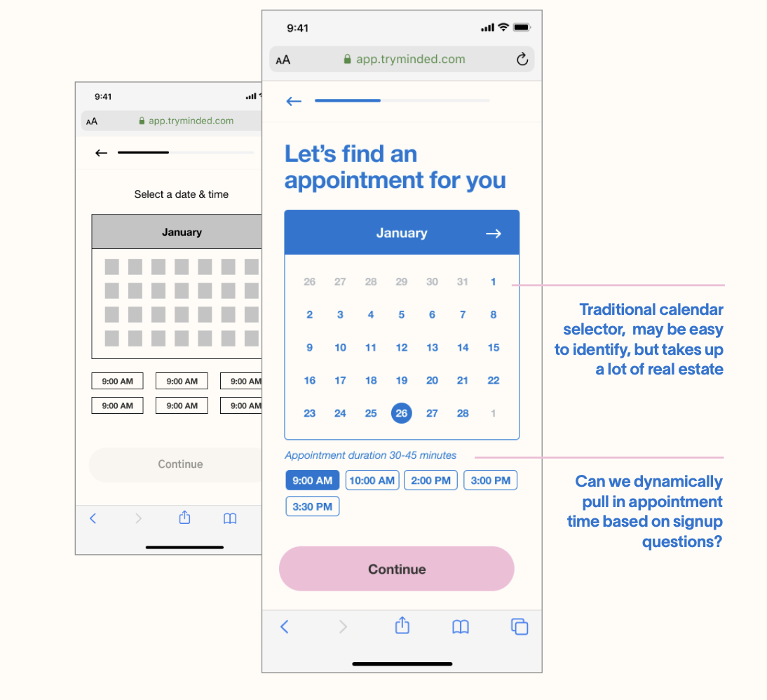
Explorations Lofi to Hifi
Explorations done of calendar layout and appointment selection help users quickly identify and select their appointment time while staying with our brand/design system style.

Usability Testing
Updated User Flow
Positive:
Date and time:
“Very quick easy”
Simplicity of date and time picker
Dragged dates over easily (intuitive)
Seeing dates and times on the same screen
Choosing date first and then seeing the available times
Appointment duration display
Confirmation, appointment details:
Appointment summary with picture of provider, bio, date and time
Gives familiarity and comfort
Bio and face of the person they will be meeting with
Acknowledged “holding” language with neutral or positive response
Acknowledgement of confirmation once membership is activated
1/10 users would have preferred to see a traditional calendar view
Negative/Painpoint
Date and time:
Prefer to choose who (the provider) before selecting a date and time.
Choice of male or female
Prefer to see calendar view (referenced having same view as the calendar you use to add meetings, appts ex: apple calendar, google calendar)


Updated screens for implementation
